Web Design
Web design is where I really began my journey. There is always something magical about the first thing you did that gives you that feeling of self-actualization. One of the things I enjoy about websites is how every industry has developed their own standards, feel and experience. I love starting projects for industries I have never designed for before, because it gives me the opportunity to research and try something new. There are also progressive trends in web design, and after taking a break from web design for the better part of a decade, it was refreshing to see the direction it had gone. I can't actually show most of the work I've done for clients due to NDAs. Therefore, what I can show is more of my side projects and personal projects. I am also pretty decent with HTML/CSS (I can edit some JS and PHP too), afterall, I did all of it for this site, along with hosting it on my Ubuntu VPS, however, I do not keep up with most web technology anymore like React, Node, Angular, etc.WokeQuotes.com
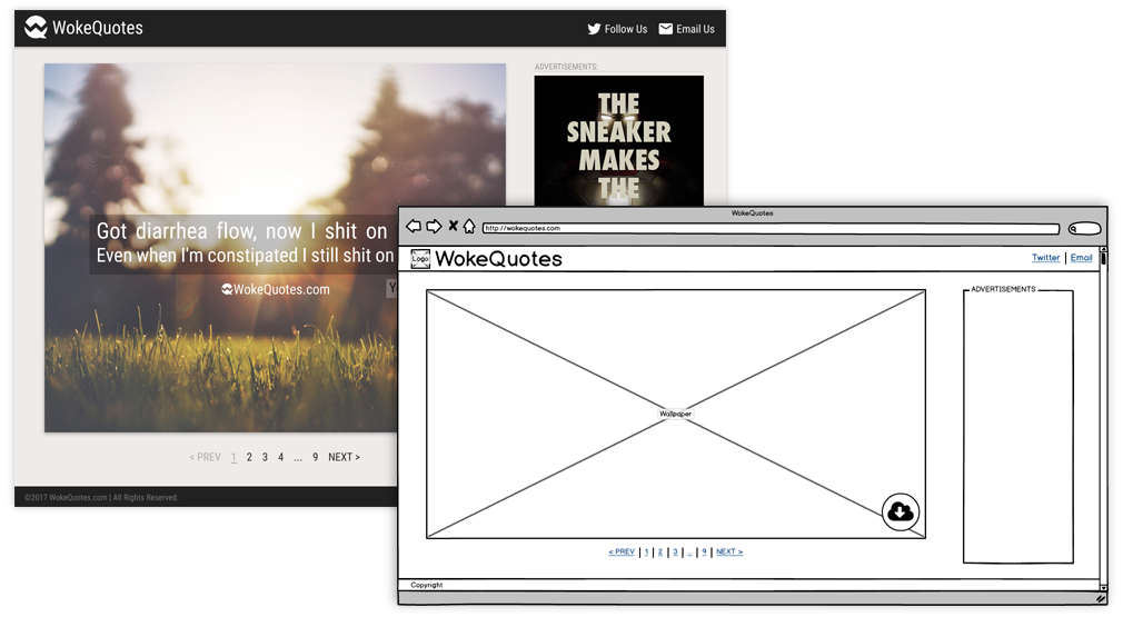
Above is a wireframe made in Balsamiq that I turned into a high fidelity comp. This is for a personal website project. The concept for the site was very basic: it is a site for inspirational wallpapers like Brainy Quote or Quote Fancy, but instead of inspirational quotes, they have quotes from rap songs. Rap lyrics can be both inspirational and humorous, which made this a fun little project. The idea for the site was to host this content in a simple and undistracting way. I keep a rotation of inspirational quotes on my work laptops, so I already had a good idea of the direction for the content and website of this project. The hardest part was coming up with a good name, which my wife actually came up with.
After making the wireframe, I created a high fidelity comp to really breath life into this project. You'll notice that this comp transitioned almost perfectly from the wireframe. I created the color scheme, designed the logo, and even generated a dozen wallpapers to really get a feel for the direction of the site. I did try partnering with a developer to bring this site to fruition in Angular. After some set backs in schedule and technical challenges, I ended up just grabbing a WordPress theme and throwing an MVP out there to see if people even liked the idea.
LiftSesh
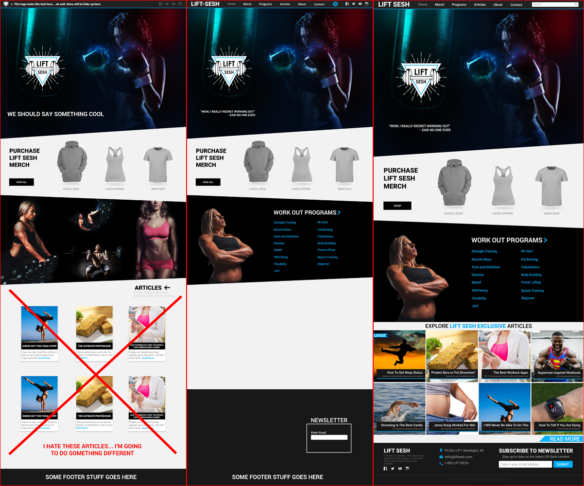
LiftSesh is a fitness community owned by my developer's brother with ambitions to grow into merchandise sales. I was asked to design a website concept for this project. The logo already existed, and the requirements were simple. This was a really fun project, because I had not designed anything similar previously. I started by researching major fitness brands like Nike and Adidas. I looked at gym websites and concepts on dribbble. Fitness sites tend to have a darker color theme and have a large focus on imagery. When it comes to fitness, beautiful people sell. I took this inspiration, along with some of the sharp angles, and started to piece together my version of a fitness site. I had a pretty good idea of my direction out of the gate, but you can see some of the iterations I made while working through the main page. I also supplemented it with royalty free stock photos, since this was for a new community that didn't have an established budget and limited photography.
UGC
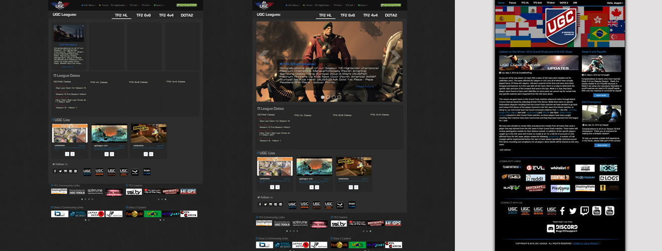
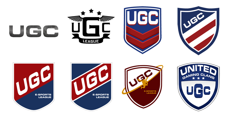
UGC is an eSports League that I was an admin for 4 years. I wrote articles, tutorials, created promotional graphics and videos. The site itself is managed by the owner in Cold Fusion and utilizes a paid for theme. The web experience is something that often bothered me, so I started an iterative process of redesigning the homepage. The hope was to get the owner's buy in by showing the possibilities for a more aesthetically pleasing index and we could continue from there. The first iteration is fairly similar to the current theme, and the last was my rendition of where I thought the site could go. In order to get from the first concept to the last, I spent some time looking at redesigning the logo, which was already something that was being discussed because they wanted one that is game agnostic. Some of the iterations for the logo are shared below, the last logo is actually used today. I really wanted to capture the sports aspect of it, but also give it a modern feel. Not only that, but the current home page is really cluttered and the navigation is confusing. The goal was to clean it up and simplify it a bit, while still offering valuable content. Ultimately, the owner didn't want to invest in the changes and was looking for a different direction. It was still a good exercise.
Lone Wolff Technologies (WIP)
Lone Wolff Technologies is a company my old colleague started. The "Wolff" is purposefully mispelled because it is his last name. The company is a side-project that allowed us to do the work for Daily Deals and I was later asked to be a partner. The first thing I was asked to do was design a logo for the company. I reflected on the name for a while, then after doing some Google searches to make sure no one else had used such a simple design, I proceeded to draw it up in Illustrator. I purposefully chose to include the full body of the wolf and avoided the color red because I didn't want it to look like ThunderCats. However, I made the cardinal mistake of not searching for a company with the proper spelling of the name and it turns out, we had similar ideas.
Anyway, most of our free time goes towards helping customers, but I am in the process of designing our website. It is a lot of work because I am responsible for the design, colors, themes and all written content. Attached is a mockup of the direction we're going (click to see larger).

