App Design
My favorite part about working in IT is enhancing people's lives through technology. This is really the essence of mobile technology. A good app has identified a mobile moment. Forester describes a mobile moment as "a point in time and space when someone pulls out a mobile device to get what he or she wants immediately, in context." No different than the purpose of the original hardware created for mobile phones in the first place. I try to take this user-centric standpoint with all of my designs.
On top of the usability aspects, I just love Native App design. Where as a web page may look barren due to the larger canvas, the smaller screen size quickly becomes cluttered. This really limits the design to a simpler and organically minimalistic approach. Also, the vertical screen is easier for reading and scrolling, whereas the horizontal screen is more suited to the consumption of media. And since user experience research has shown that users are very comfortable scrolling vertically, the vertical layout only helps with that approach.
Unfortunately, I am not able to share everything I've worked on, but what I can I have.
DRINK IT!
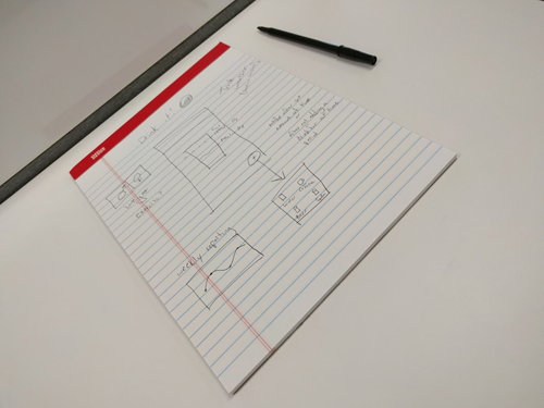
Here is a picture of a water tracking app I drew up while talking to my developer from the HIIT IT! App. I don't hand draw a lot, but it can be very useful when communicating ideas. I also think that in general designers spend too much time on high fidelity comps, myself included. The app itself is not overly original, we were discussing potentially creating a suite of applications based around health. We first started working together in QA when I helped him with a Nutritional App for his college project.
HIIT IT!
HIIT IT! (High-Intensity Intermittent Training Interval Timer) is a tool I made with the help of a native app developer. In it's simplest form, it is a timer but instead of counting it plays music for that duration. This was something that I wanted when working out but I could not find any apps that did this (since our release years ago there are now others). When designing it, Material Design was new and I wanted to stick to it as closely as possible. I also wanted to choose a color scheme that was less common, so I went with the orange and white design you see today. From there, I did a bunch of research looking into current media players, music players and timer apps. I also looked at a lot of concepts online that other designers had posted to sites like dribbble. My first iteration I wanted as few screens as possible and the inability to encounter an error state. As time went on, the complexity grew and I realized that even a simple timer app has a lot of little nuances. We have had a lot of trial and error and discussions along the way. The MVP that we released requires the user to have media on their phone, which we feel is a huge limitation in the app. Our next feature was to release Spotify support but a combination of limitations in the Spotify SDK / API and my developer having 3 jobs and his first baby has resulted in minimal work being done.
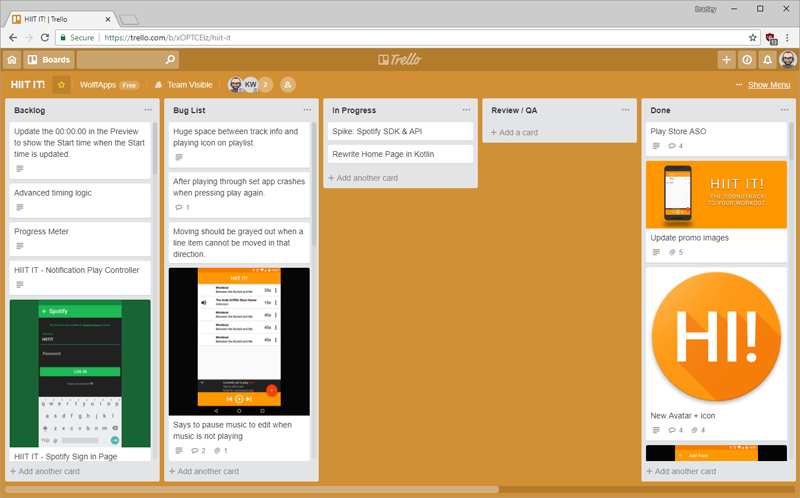
Above is my Trello board for the HIIT IT! App, which can be found on the Play Store. Everything that happens in the app is documented on this board in tickets. We also use Crashlytics for developer build distribution, daily usage reportings and error logging. Both of these are hooked up to a Slack workspace using slackbots to communicate real-time changes. Below you can see the two tickets that I wrote up, along with some mockups for Spotify integration.
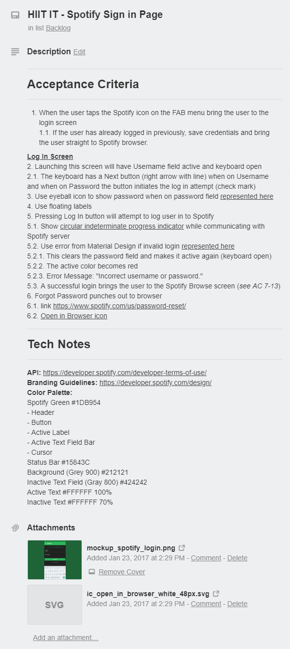
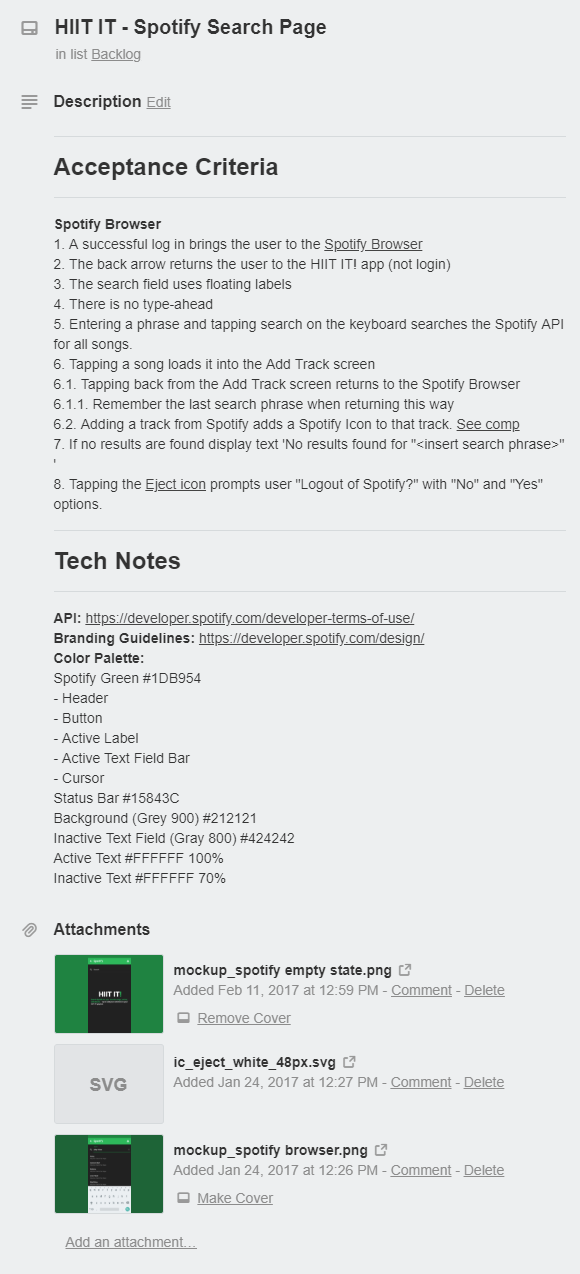
Initially I wanted to design something that felt exactly like you were in Spotify, but with only a portion of the functionality. However, after studying each page of the Spotify App, I was unsatisfied with the current implementation, so I added my own flare. The AC likely would be expanded upon during the actual development and testing as we learn more through collaboration. However, so far my developer has found that our ability to use our own screens may be limited when integrating with the Spotify SDK, which means I may have done extra work by designing before the tech analysis. This is a great lesson in process if we were a company, however, I enjoyed the experience none-the-less.
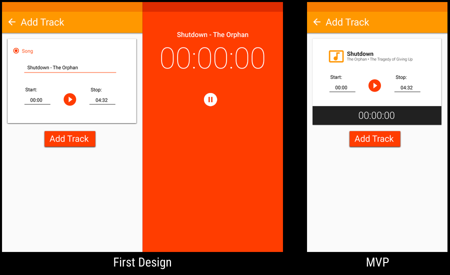
When the app was first designed, there was no way to preview the music without adding it and playing it. I quickly found this frustrating, because if I wanted to only play a 20s clip of a particular section of a song, I had to either find the spot in a different app or through repeatedly going back and forth in our app. This was the first new feature we added to the app. On the left you will see my initial design. I wanted some fancy animation the grew out from the circle to a full-screen view and animated back when stopping. In hindsight, not only was it a bit frivolous, but likely wasn't the best solution. Either way, the implementation was overly complicated, and so I created the design on the right which was a much easier implementation and ultimately experience. You will notice we took the opportunity to update the other elements of the page a little bit, since the original, original screen was shared between adding music and a timer.
HIIT IT! was a great learning experience, because I was responsible for everything but the code. I had to create the promotional images on the Play Store, along with the header, and any writing that went along with it.
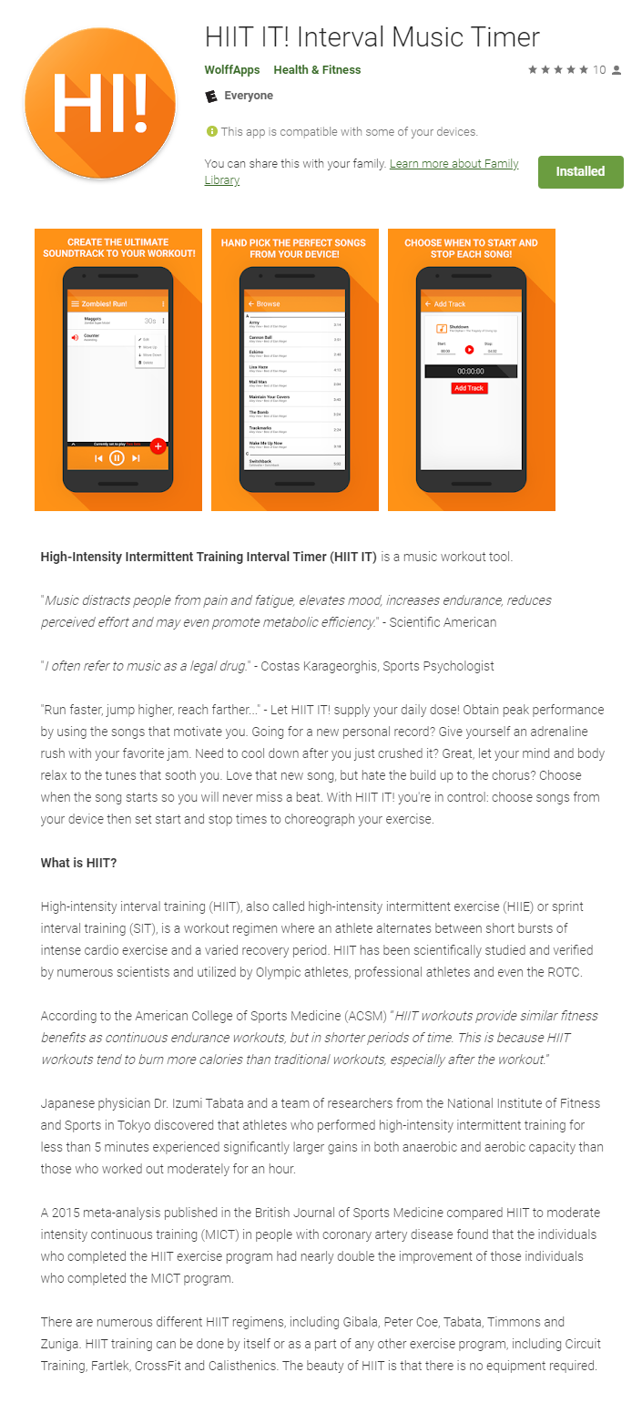
In order to do Search Engine Optimization (SEO) in the Play Store, you need to use keywords in your description repeatedly, without it looking like you are trying to game the search engine. You will notice that I say "HIIT" many times throughout this description. With that said, the name and description only play a fraction in the grand scheme. Google optimizes mostly by number of downloads and ratings.
On the left you will see the original icon I designed for the app. After Android moved to circular icons, I used the opportunity to revamp the icon to something I felt was more fun and modern, and frankly, more relevant. There was a lot of trial and error with the first icon. The documentation as far as uploading an icon is concerned is not ideal and you really just don't know how it's going to look until it's there.
TV Binge Calculator
The Television Binge Calculator, found on the Play Store. It's a nifty little app that does the math required to feel guilty for all of the television you watch... Just kidding. It's targeted towards the busy consumer who doesn't have a lot of time and there wants to know what sort of investment he or she has to make to complete a show. This was an app my boss at Meijer owned and developed.
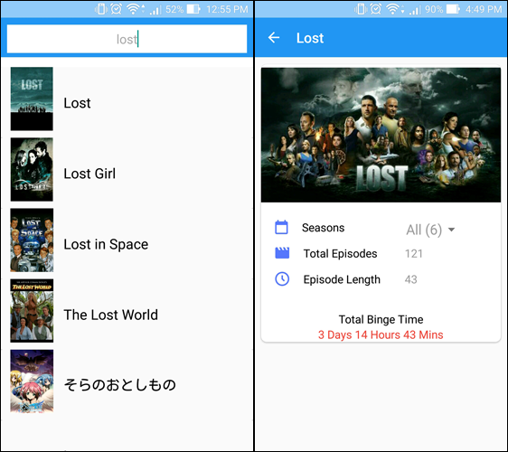
Pictured to the left are actual screenshots from the original app which was not designed by me. The owner recruited me not only to revamp the UI, but also add new features. Since he was the owner and programmer, every design and feature had to be approved by him, which was a little bit different dynamic. The one thing he was adamant about keeping was the main blue color and it had to be Material Design.
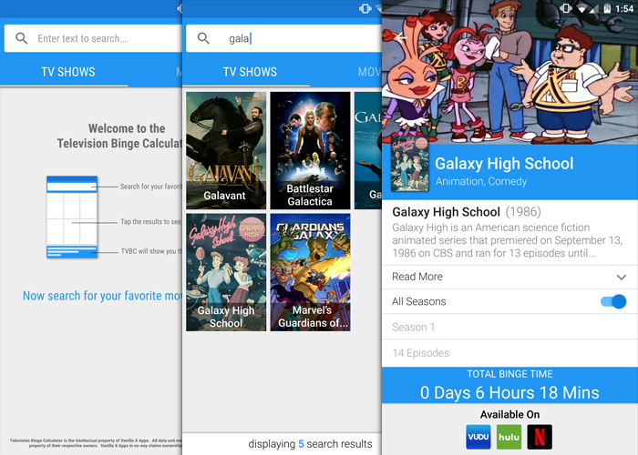
This is the updated design I made for him. I created a landing page for first time users. Next, I reorganized the search page results to display larger pictures for better scanability but also in a grid so that more could be displayed at once (including empty states for when images were not available). Included also is a bar at the bottom that shows how many results are being returned, which is useful when there are more than 9. Finally I updated the detail page. I enhanced it by including the genre, year it first went on the air and a description. I also wanted an easy way to toggle all seasons, but also the ability to do a more advanced calculation based on season and number of episodes you had left within that season. At the bottom is also another feature I came up with to display where this show is available for streaming.
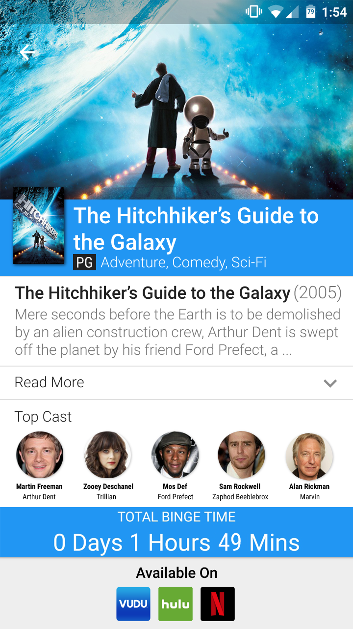
The owner wanted to add support for movies as well. Since there is not a need to calculate seasons and episodes, I created an updated version of the detail page to show relevant information.
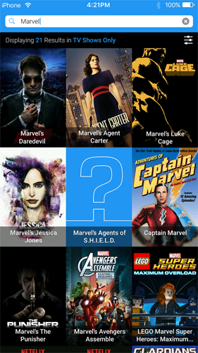
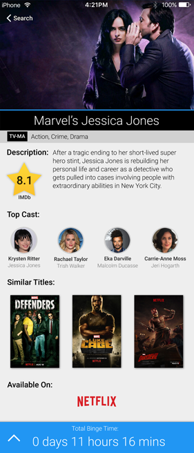
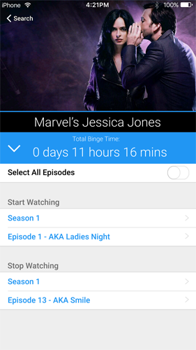
The owner wanted to create an iOS version of the app. Most of the functionality and flow is the same, but I wanted to give it more of an iOS feel. Android tends to have more of a matte or paper feel to it, where as iOS tends to have more of a glossy, clean experience. Although I am an Android user and mostly use Material Design, I am well versed in the Human Interface Guide (HIG) and it was a lot of fun to attempt a different style. I also had the idea to add Similar Titles to the page, so I threw that into the mockup to pitch it to the owner.
Meijer
At Meijer, I had a lot of ideas that went through the Product Owner and Designers. Everyone on the team collaborated really well to take ideas and flush them out. We used analytics, usability testing, and beta testing to validate our assumptions and identify new enhancements. During my time there, we as a team redesigned and expanded on every aspect of the Android and iOS apps. We adhered to the Material Design Guidelines and HIG (Human Interface Guide). My team also created the Shop and Scan app as a Hackathon project.
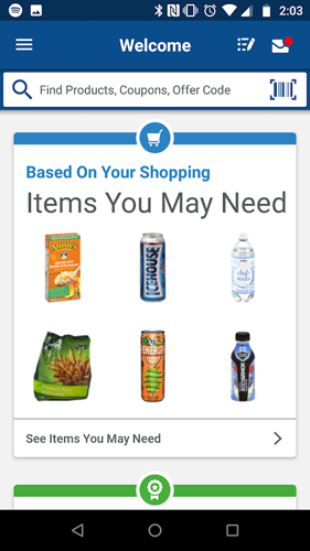
Below is a prototype that I put together using InVision to show what a bottom navigation could look like on Android. I also made a few tweaks to the current design, to include the search bar in the header and the messages in the top right. The bottom navigation was never added, and the search bar was updated to be an open field that sticks to the header (previously it was an icon you had to activate and was easy for users to overlook). They also added the messages in the top right. Along with these minor changes, they updated the home screen to a more card like experience based on a different wireframe I made and included a card for items based on your shopping history (although my idea was to only show items that were on sale). These changes are captured in the following screenshot.
I felt like the home screen as seen in the Invision Prototype was not overly useful to the user. The initial home screen was designed in an attempt to show the user the value they were getting from mPerks. Majority of the time there were no rewards available to redeem, and so it really was doing the opposite.
Most of the stories I wrote and designs I made I left at Meijer. These included wireframes, flows, prototypes and high fidelity comps. I did the icon for an app an intern did and I designed out a standalone app that we fully developed and demoed to the CIO but never was released to the public. I also designed the web portal when you connect to the Meijer WiFi within the store.
Pizza Time
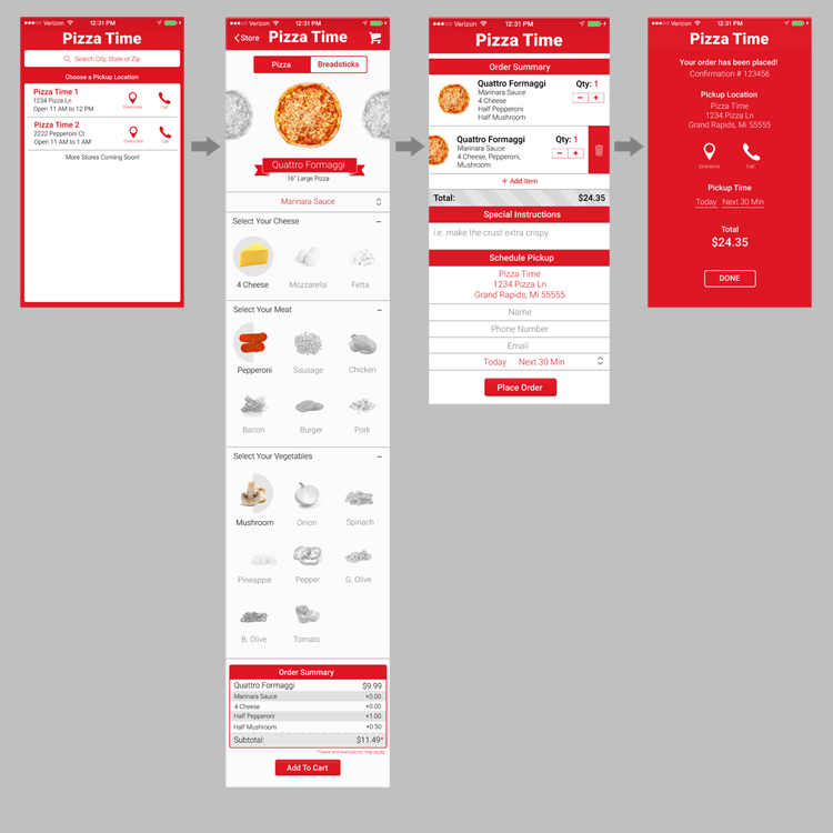
Here is a basic workflow of an iOS Pizza App that I designed. The style is supposed to be reminiscent of a pizza parlor. I tried to make the experience as simple for the user as possible. I spent a lot of time installing various pizza apps, and went through the painstaking effort of ordering (and eating) pizza through most of them. Dominos was my favorite, but all of them I felt could have been improved upon. Missing from this design is a way to login or pull up previous orders.
Daily Deals
I established the user flow and designed the user interface for Daily Deal's mobile app. I was given relatively free reign of the design, however, I did have to leverage the company's branding and color palette and they did have some specific requests throughout. Likewise, my development team had to partner with a vendor for the in-store portion of the loyalty program that provided no tech spec or documentation as to how their program worked (and were designing it at the same time as us). Therefore, I had to work in a lot of ambiguity and attempted to mitigate that with constant feedback. This whole project was delivered in a phased approach with the expectation that it will grow and more features will be added later.
Available on the Android Play Store and iOS App Store